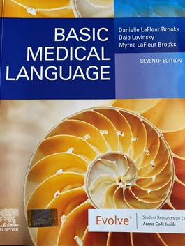
Try these 5 tips to avoid Death by PowerPoint when teaching your medical terminology class.

The purpose of PowerPoint slides is to create visual support for your lecture. Used properly, PowerPoint is a powerful tool to enhance learning. Used carelessly, it can both hinder learning and lead to death by PowerPoint.
Death by PowerPoint is the presentation that seems to never end; the one you stop listening to well before it is over. You probably have experienced this.
The next time you prepare slides for your class, make sure your PowerPoint presentation enhances learning. Consider these five tips.
#1 Avoid Using Too Many Slides
“What’s the right number of slides?”
The right number is the exact number to convey your lecture content – no more and no less. Some instructors can give an effective 50-minute lecture with 1 or 2 slides while others may effectively use 30 or more.

Create a set of slides that flow nicely and augments your lecture, keeping in mind that you will not be reading from those slides. Why not? Because the students can read slides faster than you can say the words out loud. This creates conflict for the students- should they read or listen to you? And not reading from your slides reduces the number of slides you’ll need.
Pro Tip: Review each slide and ask “Do I need this one?” Remember, you will not be reading from the slide.
#2 Provide Enough White Space
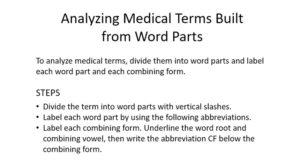
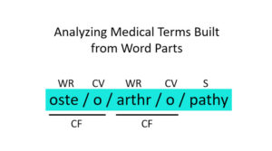
White space—or “empty” space—is critical to your slide. It guides students to clearly identify your most important point and makes your message easier to understand. White space helps the class stay focused and connects what you say with what the students see on the slide. Also, enough white space helps the slide appear simple.
Not enough white space creates a noisy, cluttered slide. Cluttered slides obscure clarity thus giving no sense of priorities. This is a sure recipe for boredom.
Pro Tip: Review each slide. Is it noisy? Cluttered? Does it need more white space? Is the slide simple in design?
#3 Avoid Using Too Many Words and Not Enough Visuals
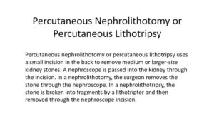

Use only simple visuals to reinforce the key points of your lecture. The typical slide set up with words and/or bullet points convey information but, unlike an image, does not elicit emotion. The message is not as powerful as it could be if an image were used.
Pro Tip: Review each slide. Are there too many words? Would a simple image be stronger? Would the written information on the slide be more powerful if you added an image? Is your slide visually simple enough to easily enhance your lecture?
#4 Avoid Slides Doubling as Handouts


PowerPoint slides are used to visually support the message of your lecture; they are not the message. Therefore, your PowerPoint presentation is not a document to be distributed to the students. If you think you need to give the students a handout, create a separate document. By keeping your slides distinct and separate from your handouts, the slides can retain their simple, clear focus, while the handouts provide supplementary follow-up details.
Pro Tip: When creating a slide presentation, remember each slide is visual support for the content of your lecture. Create a separate document for handouts. If the content from the slide is helpful, include it in the handout.
# 5 Avoid Thinking Your Slides Are for You
Many of us, especially those new to teaching, make the mistake of thinking of their slides as their lecture notes. Keep in mind that the purpose of slides is to help students engage with the lecture content and to visually help them remember information. Slides are not intended for you to use as lecture notes
Pro Tip: Review each slide. Ask yourself “Is this slide here to help me with the lecture? Or is it here to help my students understand and remember the lecture content?”
Avoiding Death by PowerPoint
You have worked hard to prepare your lecture. Now is the fun part, creating the PowerPoint presentation that will help transfer your message to your students. By applying these five tips to avoid death by PowerPoint, you can be confident your students will not be bored or conflicted. Instead, they will easily engage with your presentation and remember what they’ve learned.
Your students will appreciate your thoughtfulness.
Contributor: Gary Horsman, PowerPoint Coach
Medical Terminology PowerPoint tips slide content from Exploring Medical Language 10th Edition, Elsevier.
History of PowerPoint

